
How to use
On this page
What is theming?
The Red Hat Design System uses a powerful, flexible, and easy-to-use theming system to modify our elements and patterns to fit a specific visual style. Themes can be applied to an element, page, or UI. Theming encompasses device light and dark color schemes, our color palettes and tokens, and design customizations.
How does it work?
Our design system includes built-in branded and accessible defaults, so all you need to do if you want to create digital experiences that feel like Red Hat is to write a few lines of HTML.
When we want to flex our design muscles, our elements include powerful theming primitives in the form of slots, design tokens, and CSS shadow parts. These primitives enable you to theme a single element, section, page, or entire app UI.
Terminology
Before we dive into things, let's take a moment to clarify some terminology used around color.
Color scheme
Refer to color schemes as light (light mode) or dark (dark mode) only. Do
not use terms like light theme or dark theme.
Color schemes are built into web browsers and operating systems, and form the standard backbone of our theming engine.
Helpful tip
Previous versions of RHDS refer to color schemes as on or backgrounds.
Helpful tip
Elements that have a color context consumer color scheme is because they reacted passively to the color scheme of their containers.
Color palette
Refer to color palettes as lightest, lighter, light, dark, darker, or
darkest only.
Color palettes are unique to RHDS and build upon standard color schemes. They apply to elements which contain other elements.
Helpful tip
Previous versions of RHDS referred to elements with a color palette as color context providers because setting their color palette would actively change the color scheme of the descendant elements as well.
Theming
The process by which the appearance of RHDS elements are customized by tweaking theme variables. Single elements or entire pages can be themed.
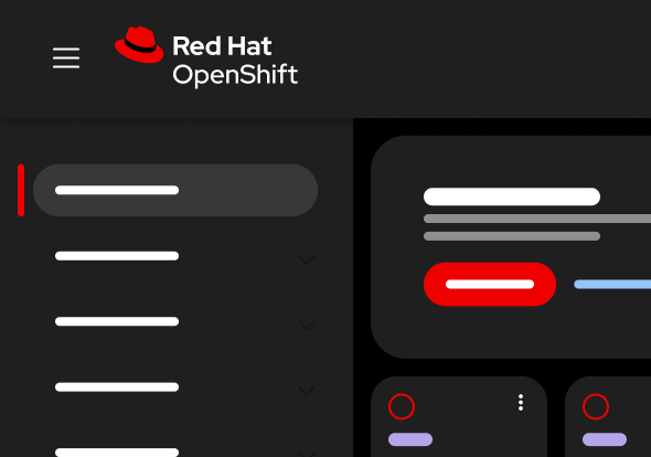
Project Felt theme
Cross-team initiative to unify the Red Hat brand, marketing experiences, and product UIs.
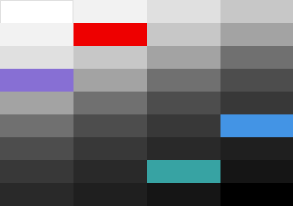
Color palettes
Design system color palettes integrate tokens with elements and patterns to produce striking layouts.
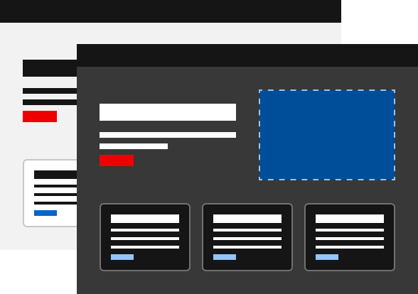
Customizing
How named design tokens and semantically-defined color palettes open up theming possibilities.
Developer
Tools and techniques to help you develop custom themes.
Other libraries
To learn more about our other libraries, visit this page.
Feedback
To give feedback about anything on this page, contact us.
Other libraries
To learn more about our other libraries, visit the getting started page.
